free UI sections and components / components
form inputs
By Andrea Buttarelli, founder of Feega · Free · Svelte, React, Vue, Astro, HTML
Text input, select, checkbox, radio, switch and textarea with labels, hints and an error state.
code
<form class="fl-form-inputs" action="#">
  <label class="fl-field" for="fl-inputs-name">Project name<input class="fl-input" id="fl-inputs-name" type="text" placeholder="My website" /><small>Shown in the sidebar.</small></label>
  <label class="fl-field bad" for="fl-inputs-url">Domain<input class="fl-input" id="fl-inputs-url" type="text" value="example" aria-invalid="true" aria-describedby="fl-inputs-url-error" /><small id="fl-inputs-url-error">Enter a full domain, like example.com.</small></label>
  <label class="fl-field" for="fl-inputs-plan">Plan<select class="fl-input" id="fl-inputs-plan"><option>Starter</option><option>Pro</option><option>Business</option></select></label>
  <label class="fl-field" for="fl-inputs-notes">Notes<textarea class="fl-input" id="fl-inputs-notes" rows="3" placeholder="Anything we should know"></textarea></label>
  <fieldset><legend>Visibility</legend>
    <label class="radio"><input type="radio" name="fl-inputs-visibility" checked />Private</label>
    <label class="radio"><input type="radio" name="fl-inputs-visibility" />Team</label>
    <label class="radio"><input type="radio" name="fl-inputs-visibility" />Public</label>
  </fieldset>
  <fieldset><legend>Options</legend>
    <label class="fl-check"><input type="checkbox" checked />Send me updates</label>
    <label class="toggle"><input class="fl-switch" type="checkbox" checked />Auto publish</label>
  </fieldset>
</form>

<style>
.fl-form-inputs{font-family:var(--feega-font);font-size:var(--feega-text-body);line-height:1.5;letter-spacing:var(--feega-tracking);color:var(--feega-fg);background:var(--feega-bg);-webkit-font-smoothing:antialiased}
:where(.fl-form-inputs) *,:where(.fl-form-inputs) *::before,:where(.fl-form-inputs) *::after{box-sizing:border-box}
:where(.fl-form-inputs) :is(h1,h2,h3,h4,p,ul,ol,figure,blockquote,dl,dd){margin:0}
:where(.fl-form-inputs) a{color:inherit;text-decoration:none}
:where(.fl-form-inputs) :focus-visible{outline:2px solid var(--feega-focus);outline-offset:3px}
.fl-field{display:grid;gap:var(--feega-space-2);font-size:var(--feega-text-sm);font-weight:500}
.fl-input{width:100%;min-height:44px;padding:0 var(--feega-space-4);border:1px solid var(--feega-line);border-radius:var(--feega-radius-md);background:var(--feega-input);color:var(--feega-fg);font:inherit;font-size:var(--feega-text-body);font-weight:400;letter-spacing:var(--feega-tracking);transition:border-color var(--feega-dur-fast) var(--feega-ease),box-shadow var(--feega-dur-fast) var(--feega-ease)}
.fl-input::placeholder{color:var(--feega-fg-subtle)}
.fl-input:hover{border-color:var(--feega-line-strong)}
.fl-input:focus{outline:none;border-color:var(--feega-accent);box-shadow:0 0 0 4px var(--feega-accent-soft)}
.fl-check{display:inline-flex;align-items:center;gap:var(--feega-space-3);font-size:var(--feega-text-sm);cursor:pointer}
.fl-check input{appearance:none;display:grid;place-items:center;width:18px;height:18px;margin:0;border:1px solid var(--feega-line-strong);border-radius:var(--feega-radius-xs);background:var(--feega-input);cursor:pointer;transition:background-color var(--feega-dur-fast) var(--feega-ease),border-color var(--feega-dur-fast) var(--feega-ease)}
.fl-check input::after{content:"";width:8px;height:8px;background:var(--feega-accent-fg);transform:scale(0);transition:transform var(--feega-dur) var(--feega-ease)}
.fl-check input:checked{border-color:var(--feega-accent);background:var(--feega-accent)}
.fl-check input:checked::after{transform:scale(1)}
.fl-switch{appearance:none;position:relative;flex:none;width:40px;height:24px;margin:0;border-radius:var(--feega-radius-full);background:var(--feega-line-strong);cursor:pointer;transition:background-color var(--feega-dur) var(--feega-ease)}
.fl-switch::after{content:"";position:absolute;top:3px;left:3px;width:18px;height:18px;border-radius:var(--feega-radius-full);background:var(--feega-raised);box-shadow:var(--feega-shadow);transition:transform var(--feega-dur) var(--feega-ease)}
.fl-switch:checked{background:var(--feega-accent)}
.fl-switch:checked::after{transform:translateX(16px)}
.fl-form-inputs{display:grid;align-items:start;grid-template-columns:repeat(2,minmax(0,1fr));gap:var(--feega-space-6);padding:var(--feega-space-8) var(--feega-gutter)}
.fl-form-inputs small{color:var(--feega-fg-subtle);font-size:var(--feega-text-xs);font-weight:400}
.fl-form-inputs .bad .fl-input{border-color:var(--feega-danger)}
.fl-form-inputs .bad .fl-input:focus{box-shadow:0 0 0 4px var(--feega-danger-soft)}
.fl-form-inputs .bad small{color:var(--feega-danger)}
.fl-form-inputs select.fl-input{height:44px;appearance:auto}
.fl-form-inputs textarea.fl-input{padding-block:12px;resize:vertical}
.fl-form-inputs fieldset{display:grid;align-content:start;gap:var(--feega-space-3);margin:0;padding:0;border:0}
.fl-form-inputs legend{margin-bottom:var(--feega-space-3);padding:0;font-size:var(--feega-text-sm);font-weight:500}
.fl-form-inputs .radio,.fl-form-inputs .toggle{display:inline-flex;align-items:center;gap:var(--feega-space-3);font-size:var(--feega-text-sm);cursor:pointer}
.fl-form-inputs .radio input{appearance:none;display:grid;place-items:center;width:18px;height:18px;margin:0;border:1px solid var(--feega-line-strong);border-radius:var(--feega-radius-full);background:var(--feega-input);cursor:pointer;transition:border-color var(--feega-dur-fast) var(--feega-ease)}
.fl-form-inputs .radio input::after{content:"";width:8px;height:8px;border-radius:var(--feega-radius-full);background:var(--feega-accent);transform:scale(0);transition:transform var(--feega-dur) var(--feega-ease)}
.fl-form-inputs .radio input:checked{border-color:var(--feega-accent)}
.fl-form-inputs .radio input:checked::after{transform:scale(1)}
@media (max-width:640px){.fl-form-inputs{grid-template-columns:minmax(0,1fr)}}
@media (prefers-reduced-motion:reduce){:where([class^="fl-"]) *,:where([class^="fl-"]) *::before,:where([class^="fl-"]) *::after{animation:none!important;transition:none!important}}
</style>
import './FormInputs.css';

export function FormInputs() {
  return (
    <form className="fl-form-inputs" action="#">
      <label className="fl-field" htmlFor="fl-inputs-name">Project name<input className="fl-input" id="fl-inputs-name" type="text" placeholder="My website" /><small>Shown in the sidebar.</small></label>
      <label className="fl-field bad" htmlFor="fl-inputs-url">Domain<input className="fl-input" id="fl-inputs-url" type="text" defaultValue="example" aria-invalid="true" aria-describedby="fl-inputs-url-error" /><small id="fl-inputs-url-error">Enter a full domain, like example.com.</small></label>
      <label className="fl-field" htmlFor="fl-inputs-plan">Plan<select className="fl-input" id="fl-inputs-plan"><option>Starter</option><option>Pro</option><option>Business</option></select></label>
      <label className="fl-field" htmlFor="fl-inputs-notes">Notes<textarea className="fl-input" id="fl-inputs-notes" rows="3" placeholder="Anything we should know"></textarea></label>
      <fieldset><legend>Visibility</legend>
        <label className="radio"><input type="radio" name="fl-inputs-visibility" defaultChecked />Private</label>
        <label className="radio"><input type="radio" name="fl-inputs-visibility" />Team</label>
        <label className="radio"><input type="radio" name="fl-inputs-visibility" />Public</label>
      </fieldset>
      <fieldset><legend>Options</legend>
        <label className="fl-check"><input type="checkbox" defaultChecked />Send me updates</label>
        <label className="toggle"><input className="fl-switch" type="checkbox" defaultChecked />Auto publish</label>
      </fieldset>
    </form>
  );
}
.fl-form-inputs{font-family:var(--feega-font);font-size:var(--feega-text-body);line-height:1.5;letter-spacing:var(--feega-tracking);color:var(--feega-fg);background:var(--feega-bg);-webkit-font-smoothing:antialiased}
:where(.fl-form-inputs) *,:where(.fl-form-inputs) *::before,:where(.fl-form-inputs) *::after{box-sizing:border-box}
:where(.fl-form-inputs) :is(h1,h2,h3,h4,p,ul,ol,figure,blockquote,dl,dd){margin:0}
:where(.fl-form-inputs) a{color:inherit;text-decoration:none}
:where(.fl-form-inputs) :focus-visible{outline:2px solid var(--feega-focus);outline-offset:3px}
.fl-field{display:grid;gap:var(--feega-space-2);font-size:var(--feega-text-sm);font-weight:500}
.fl-input{width:100%;min-height:44px;padding:0 var(--feega-space-4);border:1px solid var(--feega-line);border-radius:var(--feega-radius-md);background:var(--feega-input);color:var(--feega-fg);font:inherit;font-size:var(--feega-text-body);font-weight:400;letter-spacing:var(--feega-tracking);transition:border-color var(--feega-dur-fast) var(--feega-ease),box-shadow var(--feega-dur-fast) var(--feega-ease)}
.fl-input::placeholder{color:var(--feega-fg-subtle)}
.fl-input:hover{border-color:var(--feega-line-strong)}
.fl-input:focus{outline:none;border-color:var(--feega-accent);box-shadow:0 0 0 4px var(--feega-accent-soft)}
.fl-check{display:inline-flex;align-items:center;gap:var(--feega-space-3);font-size:var(--feega-text-sm);cursor:pointer}
.fl-check input{appearance:none;display:grid;place-items:center;width:18px;height:18px;margin:0;border:1px solid var(--feega-line-strong);border-radius:var(--feega-radius-xs);background:var(--feega-input);cursor:pointer;transition:background-color var(--feega-dur-fast) var(--feega-ease),border-color var(--feega-dur-fast) var(--feega-ease)}
.fl-check input::after{content:"";width:8px;height:8px;background:var(--feega-accent-fg);transform:scale(0);transition:transform var(--feega-dur) var(--feega-ease)}
.fl-check input:checked{border-color:var(--feega-accent);background:var(--feega-accent)}
.fl-check input:checked::after{transform:scale(1)}
.fl-switch{appearance:none;position:relative;flex:none;width:40px;height:24px;margin:0;border-radius:var(--feega-radius-full);background:var(--feega-line-strong);cursor:pointer;transition:background-color var(--feega-dur) var(--feega-ease)}
.fl-switch::after{content:"";position:absolute;top:3px;left:3px;width:18px;height:18px;border-radius:var(--feega-radius-full);background:var(--feega-raised);box-shadow:var(--feega-shadow);transition:transform var(--feega-dur) var(--feega-ease)}
.fl-switch:checked{background:var(--feega-accent)}
.fl-switch:checked::after{transform:translateX(16px)}
.fl-form-inputs{display:grid;align-items:start;grid-template-columns:repeat(2,minmax(0,1fr));gap:var(--feega-space-6);padding:var(--feega-space-8) var(--feega-gutter)}
.fl-form-inputs small{color:var(--feega-fg-subtle);font-size:var(--feega-text-xs);font-weight:400}
.fl-form-inputs .bad .fl-input{border-color:var(--feega-danger)}
.fl-form-inputs .bad .fl-input:focus{box-shadow:0 0 0 4px var(--feega-danger-soft)}
.fl-form-inputs .bad small{color:var(--feega-danger)}
.fl-form-inputs select.fl-input{height:44px;appearance:auto}
.fl-form-inputs textarea.fl-input{padding-block:12px;resize:vertical}
.fl-form-inputs fieldset{display:grid;align-content:start;gap:var(--feega-space-3);margin:0;padding:0;border:0}
.fl-form-inputs legend{margin-bottom:var(--feega-space-3);padding:0;font-size:var(--feega-text-sm);font-weight:500}
.fl-form-inputs .radio,.fl-form-inputs .toggle{display:inline-flex;align-items:center;gap:var(--feega-space-3);font-size:var(--feega-text-sm);cursor:pointer}
.fl-form-inputs .radio input{appearance:none;display:grid;place-items:center;width:18px;height:18px;margin:0;border:1px solid var(--feega-line-strong);border-radius:var(--feega-radius-full);background:var(--feega-input);cursor:pointer;transition:border-color var(--feega-dur-fast) var(--feega-ease)}
.fl-form-inputs .radio input::after{content:"";width:8px;height:8px;border-radius:var(--feega-radius-full);background:var(--feega-accent);transform:scale(0);transition:transform var(--feega-dur) var(--feega-ease)}
.fl-form-inputs .radio input:checked{border-color:var(--feega-accent)}
.fl-form-inputs .radio input:checked::after{transform:scale(1)}
@media (max-width:640px){.fl-form-inputs{grid-template-columns:minmax(0,1fr)}}
@media (prefers-reduced-motion:reduce){:where([class^="fl-"]) *,:where([class^="fl-"]) *::before,:where([class^="fl-"]) *::after{animation:none!important;transition:none!important}}
<template>
  <form class="fl-form-inputs" action="#">
    <label class="fl-field" for="fl-inputs-name">Project name<input class="fl-input" id="fl-inputs-name" type="text" placeholder="My website" /><small>Shown in the sidebar.</small></label>
    <label class="fl-field bad" for="fl-inputs-url">Domain<input class="fl-input" id="fl-inputs-url" type="text" value="example" aria-invalid="true" aria-describedby="fl-inputs-url-error" /><small id="fl-inputs-url-error">Enter a full domain, like example.com.</small></label>
    <label class="fl-field" for="fl-inputs-plan">Plan<select class="fl-input" id="fl-inputs-plan"><option>Starter</option><option>Pro</option><option>Business</option></select></label>
    <label class="fl-field" for="fl-inputs-notes">Notes<textarea class="fl-input" id="fl-inputs-notes" rows="3" placeholder="Anything we should know"></textarea></label>
    <fieldset><legend>Visibility</legend>
      <label class="radio"><input type="radio" name="fl-inputs-visibility" checked />Private</label>
      <label class="radio"><input type="radio" name="fl-inputs-visibility" />Team</label>
      <label class="radio"><input type="radio" name="fl-inputs-visibility" />Public</label>
    </fieldset>
    <fieldset><legend>Options</legend>
      <label class="fl-check"><input type="checkbox" checked />Send me updates</label>
      <label class="toggle"><input class="fl-switch" type="checkbox" checked />Auto publish</label>
    </fieldset>
  </form>
</template>

<style scoped>
.fl-form-inputs{font-family:var(--feega-font);font-size:var(--feega-text-body);line-height:1.5;letter-spacing:var(--feega-tracking);color:var(--feega-fg);background:var(--feega-bg);-webkit-font-smoothing:antialiased}
:where(.fl-form-inputs) *,:where(.fl-form-inputs) *::before,:where(.fl-form-inputs) *::after{box-sizing:border-box}
:where(.fl-form-inputs) :is(h1,h2,h3,h4,p,ul,ol,figure,blockquote,dl,dd){margin:0}
:where(.fl-form-inputs) a{color:inherit;text-decoration:none}
:where(.fl-form-inputs) :focus-visible{outline:2px solid var(--feega-focus);outline-offset:3px}
.fl-field{display:grid;gap:var(--feega-space-2);font-size:var(--feega-text-sm);font-weight:500}
.fl-input{width:100%;min-height:44px;padding:0 var(--feega-space-4);border:1px solid var(--feega-line);border-radius:var(--feega-radius-md);background:var(--feega-input);color:var(--feega-fg);font:inherit;font-size:var(--feega-text-body);font-weight:400;letter-spacing:var(--feega-tracking);transition:border-color var(--feega-dur-fast) var(--feega-ease),box-shadow var(--feega-dur-fast) var(--feega-ease)}
.fl-input::placeholder{color:var(--feega-fg-subtle)}
.fl-input:hover{border-color:var(--feega-line-strong)}
.fl-input:focus{outline:none;border-color:var(--feega-accent);box-shadow:0 0 0 4px var(--feega-accent-soft)}
.fl-check{display:inline-flex;align-items:center;gap:var(--feega-space-3);font-size:var(--feega-text-sm);cursor:pointer}
.fl-check input{appearance:none;display:grid;place-items:center;width:18px;height:18px;margin:0;border:1px solid var(--feega-line-strong);border-radius:var(--feega-radius-xs);background:var(--feega-input);cursor:pointer;transition:background-color var(--feega-dur-fast) var(--feega-ease),border-color var(--feega-dur-fast) var(--feega-ease)}
.fl-check input::after{content:"";width:8px;height:8px;background:var(--feega-accent-fg);transform:scale(0);transition:transform var(--feega-dur) var(--feega-ease)}
.fl-check input:checked{border-color:var(--feega-accent);background:var(--feega-accent)}
.fl-check input:checked::after{transform:scale(1)}
.fl-switch{appearance:none;position:relative;flex:none;width:40px;height:24px;margin:0;border-radius:var(--feega-radius-full);background:var(--feega-line-strong);cursor:pointer;transition:background-color var(--feega-dur) var(--feega-ease)}
.fl-switch::after{content:"";position:absolute;top:3px;left:3px;width:18px;height:18px;border-radius:var(--feega-radius-full);background:var(--feega-raised);box-shadow:var(--feega-shadow);transition:transform var(--feega-dur) var(--feega-ease)}
.fl-switch:checked{background:var(--feega-accent)}
.fl-switch:checked::after{transform:translateX(16px)}
.fl-form-inputs{display:grid;align-items:start;grid-template-columns:repeat(2,minmax(0,1fr));gap:var(--feega-space-6);padding:var(--feega-space-8) var(--feega-gutter)}
.fl-form-inputs small{color:var(--feega-fg-subtle);font-size:var(--feega-text-xs);font-weight:400}
.fl-form-inputs .bad .fl-input{border-color:var(--feega-danger)}
.fl-form-inputs .bad .fl-input:focus{box-shadow:0 0 0 4px var(--feega-danger-soft)}
.fl-form-inputs .bad small{color:var(--feega-danger)}
.fl-form-inputs select.fl-input{height:44px;appearance:auto}
.fl-form-inputs textarea.fl-input{padding-block:12px;resize:vertical}
.fl-form-inputs fieldset{display:grid;align-content:start;gap:var(--feega-space-3);margin:0;padding:0;border:0}
.fl-form-inputs legend{margin-bottom:var(--feega-space-3);padding:0;font-size:var(--feega-text-sm);font-weight:500}
.fl-form-inputs .radio,.fl-form-inputs .toggle{display:inline-flex;align-items:center;gap:var(--feega-space-3);font-size:var(--feega-text-sm);cursor:pointer}
.fl-form-inputs .radio input{appearance:none;display:grid;place-items:center;width:18px;height:18px;margin:0;border:1px solid var(--feega-line-strong);border-radius:var(--feega-radius-full);background:var(--feega-input);cursor:pointer;transition:border-color var(--feega-dur-fast) var(--feega-ease)}
.fl-form-inputs .radio input::after{content:"";width:8px;height:8px;border-radius:var(--feega-radius-full);background:var(--feega-accent);transform:scale(0);transition:transform var(--feega-dur) var(--feega-ease)}
.fl-form-inputs .radio input:checked{border-color:var(--feega-accent)}
.fl-form-inputs .radio input:checked::after{transform:scale(1)}
@media (max-width:640px){.fl-form-inputs{grid-template-columns:minmax(0,1fr)}}
@media (prefers-reduced-motion:reduce){:where([class^="fl-"]) *,:where([class^="fl-"]) *::before,:where([class^="fl-"]) *::after{animation:none!important;transition:none!important}}
</style>
---
---

<form class="fl-form-inputs" action="#">
  <label class="fl-field" for="fl-inputs-name">Project name<input class="fl-input" id="fl-inputs-name" type="text" placeholder="My website" /><small>Shown in the sidebar.</small></label>
  <label class="fl-field bad" for="fl-inputs-url">Domain<input class="fl-input" id="fl-inputs-url" type="text" value="example" aria-invalid="true" aria-describedby="fl-inputs-url-error" /><small id="fl-inputs-url-error">Enter a full domain, like example.com.</small></label>
  <label class="fl-field" for="fl-inputs-plan">Plan<select class="fl-input" id="fl-inputs-plan"><option>Starter</option><option>Pro</option><option>Business</option></select></label>
  <label class="fl-field" for="fl-inputs-notes">Notes<textarea class="fl-input" id="fl-inputs-notes" rows="3" placeholder="Anything we should know"></textarea></label>
  <fieldset><legend>Visibility</legend>
    <label class="radio"><input type="radio" name="fl-inputs-visibility" checked />Private</label>
    <label class="radio"><input type="radio" name="fl-inputs-visibility" />Team</label>
    <label class="radio"><input type="radio" name="fl-inputs-visibility" />Public</label>
  </fieldset>
  <fieldset><legend>Options</legend>
    <label class="fl-check"><input type="checkbox" checked />Send me updates</label>
    <label class="toggle"><input class="fl-switch" type="checkbox" checked />Auto publish</label>
  </fieldset>
</form>

<style>
.fl-form-inputs{font-family:var(--feega-font);font-size:var(--feega-text-body);line-height:1.5;letter-spacing:var(--feega-tracking);color:var(--feega-fg);background:var(--feega-bg);-webkit-font-smoothing:antialiased}
:where(.fl-form-inputs) *,:where(.fl-form-inputs) *::before,:where(.fl-form-inputs) *::after{box-sizing:border-box}
:where(.fl-form-inputs) :is(h1,h2,h3,h4,p,ul,ol,figure,blockquote,dl,dd){margin:0}
:where(.fl-form-inputs) a{color:inherit;text-decoration:none}
:where(.fl-form-inputs) :focus-visible{outline:2px solid var(--feega-focus);outline-offset:3px}
.fl-field{display:grid;gap:var(--feega-space-2);font-size:var(--feega-text-sm);font-weight:500}
.fl-input{width:100%;min-height:44px;padding:0 var(--feega-space-4);border:1px solid var(--feega-line);border-radius:var(--feega-radius-md);background:var(--feega-input);color:var(--feega-fg);font:inherit;font-size:var(--feega-text-body);font-weight:400;letter-spacing:var(--feega-tracking);transition:border-color var(--feega-dur-fast) var(--feega-ease),box-shadow var(--feega-dur-fast) var(--feega-ease)}
.fl-input::placeholder{color:var(--feega-fg-subtle)}
.fl-input:hover{border-color:var(--feega-line-strong)}
.fl-input:focus{outline:none;border-color:var(--feega-accent);box-shadow:0 0 0 4px var(--feega-accent-soft)}
.fl-check{display:inline-flex;align-items:center;gap:var(--feega-space-3);font-size:var(--feega-text-sm);cursor:pointer}
.fl-check input{appearance:none;display:grid;place-items:center;width:18px;height:18px;margin:0;border:1px solid var(--feega-line-strong);border-radius:var(--feega-radius-xs);background:var(--feega-input);cursor:pointer;transition:background-color var(--feega-dur-fast) var(--feega-ease),border-color var(--feega-dur-fast) var(--feega-ease)}
.fl-check input::after{content:"";width:8px;height:8px;background:var(--feega-accent-fg);transform:scale(0);transition:transform var(--feega-dur) var(--feega-ease)}
.fl-check input:checked{border-color:var(--feega-accent);background:var(--feega-accent)}
.fl-check input:checked::after{transform:scale(1)}
.fl-switch{appearance:none;position:relative;flex:none;width:40px;height:24px;margin:0;border-radius:var(--feega-radius-full);background:var(--feega-line-strong);cursor:pointer;transition:background-color var(--feega-dur) var(--feega-ease)}
.fl-switch::after{content:"";position:absolute;top:3px;left:3px;width:18px;height:18px;border-radius:var(--feega-radius-full);background:var(--feega-raised);box-shadow:var(--feega-shadow);transition:transform var(--feega-dur) var(--feega-ease)}
.fl-switch:checked{background:var(--feega-accent)}
.fl-switch:checked::after{transform:translateX(16px)}
.fl-form-inputs{display:grid;align-items:start;grid-template-columns:repeat(2,minmax(0,1fr));gap:var(--feega-space-6);padding:var(--feega-space-8) var(--feega-gutter)}
.fl-form-inputs small{color:var(--feega-fg-subtle);font-size:var(--feega-text-xs);font-weight:400}
.fl-form-inputs .bad .fl-input{border-color:var(--feega-danger)}
.fl-form-inputs .bad .fl-input:focus{box-shadow:0 0 0 4px var(--feega-danger-soft)}
.fl-form-inputs .bad small{color:var(--feega-danger)}
.fl-form-inputs select.fl-input{height:44px;appearance:auto}
.fl-form-inputs textarea.fl-input{padding-block:12px;resize:vertical}
.fl-form-inputs fieldset{display:grid;align-content:start;gap:var(--feega-space-3);margin:0;padding:0;border:0}
.fl-form-inputs legend{margin-bottom:var(--feega-space-3);padding:0;font-size:var(--feega-text-sm);font-weight:500}
.fl-form-inputs .radio,.fl-form-inputs .toggle{display:inline-flex;align-items:center;gap:var(--feega-space-3);font-size:var(--feega-text-sm);cursor:pointer}
.fl-form-inputs .radio input{appearance:none;display:grid;place-items:center;width:18px;height:18px;margin:0;border:1px solid var(--feega-line-strong);border-radius:var(--feega-radius-full);background:var(--feega-input);cursor:pointer;transition:border-color var(--feega-dur-fast) var(--feega-ease)}
.fl-form-inputs .radio input::after{content:"";width:8px;height:8px;border-radius:var(--feega-radius-full);background:var(--feega-accent);transform:scale(0);transition:transform var(--feega-dur) var(--feega-ease)}
.fl-form-inputs .radio input:checked{border-color:var(--feega-accent)}
.fl-form-inputs .radio input:checked::after{transform:scale(1)}
@media (max-width:640px){.fl-form-inputs{grid-template-columns:minmax(0,1fr)}}
@media (prefers-reduced-motion:reduce){:where([class^="fl-"]) *,:where([class^="fl-"]) *::before,:where([class^="fl-"]) *::after{animation:none!important;transition:none!important}}
</style>
<form class="fl-form-inputs" action="#">
  <label class="fl-field" for="fl-inputs-name">Project name<input class="fl-input" id="fl-inputs-name" type="text" placeholder="My website" /><small>Shown in the sidebar.</small></label>
  <label class="fl-field bad" for="fl-inputs-url">Domain<input class="fl-input" id="fl-inputs-url" type="text" value="example" aria-invalid="true" aria-describedby="fl-inputs-url-error" /><small id="fl-inputs-url-error">Enter a full domain, like example.com.</small></label>
  <label class="fl-field" for="fl-inputs-plan">Plan<select class="fl-input" id="fl-inputs-plan"><option>Starter</option><option>Pro</option><option>Business</option></select></label>
  <label class="fl-field" for="fl-inputs-notes">Notes<textarea class="fl-input" id="fl-inputs-notes" rows="3" placeholder="Anything we should know"></textarea></label>
  <fieldset><legend>Visibility</legend>
    <label class="radio"><input type="radio" name="fl-inputs-visibility" checked />Private</label>
    <label class="radio"><input type="radio" name="fl-inputs-visibility" />Team</label>
    <label class="radio"><input type="radio" name="fl-inputs-visibility" />Public</label>
  </fieldset>
  <fieldset><legend>Options</legend>
    <label class="fl-check"><input type="checkbox" checked />Send me updates</label>
    <label class="toggle"><input class="fl-switch" type="checkbox" checked />Auto publish</label>
  </fieldset>
</form>
.fl-form-inputs{font-family:var(--feega-font);font-size:var(--feega-text-body);line-height:1.5;letter-spacing:var(--feega-tracking);color:var(--feega-fg);background:var(--feega-bg);-webkit-font-smoothing:antialiased}
:where(.fl-form-inputs) *,:where(.fl-form-inputs) *::before,:where(.fl-form-inputs) *::after{box-sizing:border-box}
:where(.fl-form-inputs) :is(h1,h2,h3,h4,p,ul,ol,figure,blockquote,dl,dd){margin:0}
:where(.fl-form-inputs) a{color:inherit;text-decoration:none}
:where(.fl-form-inputs) :focus-visible{outline:2px solid var(--feega-focus);outline-offset:3px}
.fl-field{display:grid;gap:var(--feega-space-2);font-size:var(--feega-text-sm);font-weight:500}
.fl-input{width:100%;min-height:44px;padding:0 var(--feega-space-4);border:1px solid var(--feega-line);border-radius:var(--feega-radius-md);background:var(--feega-input);color:var(--feega-fg);font:inherit;font-size:var(--feega-text-body);font-weight:400;letter-spacing:var(--feega-tracking);transition:border-color var(--feega-dur-fast) var(--feega-ease),box-shadow var(--feega-dur-fast) var(--feega-ease)}
.fl-input::placeholder{color:var(--feega-fg-subtle)}
.fl-input:hover{border-color:var(--feega-line-strong)}
.fl-input:focus{outline:none;border-color:var(--feega-accent);box-shadow:0 0 0 4px var(--feega-accent-soft)}
.fl-check{display:inline-flex;align-items:center;gap:var(--feega-space-3);font-size:var(--feega-text-sm);cursor:pointer}
.fl-check input{appearance:none;display:grid;place-items:center;width:18px;height:18px;margin:0;border:1px solid var(--feega-line-strong);border-radius:var(--feega-radius-xs);background:var(--feega-input);cursor:pointer;transition:background-color var(--feega-dur-fast) var(--feega-ease),border-color var(--feega-dur-fast) var(--feega-ease)}
.fl-check input::after{content:"";width:8px;height:8px;background:var(--feega-accent-fg);transform:scale(0);transition:transform var(--feega-dur) var(--feega-ease)}
.fl-check input:checked{border-color:var(--feega-accent);background:var(--feega-accent)}
.fl-check input:checked::after{transform:scale(1)}
.fl-switch{appearance:none;position:relative;flex:none;width:40px;height:24px;margin:0;border-radius:var(--feega-radius-full);background:var(--feega-line-strong);cursor:pointer;transition:background-color var(--feega-dur) var(--feega-ease)}
.fl-switch::after{content:"";position:absolute;top:3px;left:3px;width:18px;height:18px;border-radius:var(--feega-radius-full);background:var(--feega-raised);box-shadow:var(--feega-shadow);transition:transform var(--feega-dur) var(--feega-ease)}
.fl-switch:checked{background:var(--feega-accent)}
.fl-switch:checked::after{transform:translateX(16px)}
.fl-form-inputs{display:grid;align-items:start;grid-template-columns:repeat(2,minmax(0,1fr));gap:var(--feega-space-6);padding:var(--feega-space-8) var(--feega-gutter)}
.fl-form-inputs small{color:var(--feega-fg-subtle);font-size:var(--feega-text-xs);font-weight:400}
.fl-form-inputs .bad .fl-input{border-color:var(--feega-danger)}
.fl-form-inputs .bad .fl-input:focus{box-shadow:0 0 0 4px var(--feega-danger-soft)}
.fl-form-inputs .bad small{color:var(--feega-danger)}
.fl-form-inputs select.fl-input{height:44px;appearance:auto}
.fl-form-inputs textarea.fl-input{padding-block:12px;resize:vertical}
.fl-form-inputs fieldset{display:grid;align-content:start;gap:var(--feega-space-3);margin:0;padding:0;border:0}
.fl-form-inputs legend{margin-bottom:var(--feega-space-3);padding:0;font-size:var(--feega-text-sm);font-weight:500}
.fl-form-inputs .radio,.fl-form-inputs .toggle{display:inline-flex;align-items:center;gap:var(--feega-space-3);font-size:var(--feega-text-sm);cursor:pointer}
.fl-form-inputs .radio input{appearance:none;display:grid;place-items:center;width:18px;height:18px;margin:0;border:1px solid var(--feega-line-strong);border-radius:var(--feega-radius-full);background:var(--feega-input);cursor:pointer;transition:border-color var(--feega-dur-fast) var(--feega-ease)}
.fl-form-inputs .radio input::after{content:"";width:8px;height:8px;border-radius:var(--feega-radius-full);background:var(--feega-accent);transform:scale(0);transition:transform var(--feega-dur) var(--feega-ease)}
.fl-form-inputs .radio input:checked{border-color:var(--feega-accent)}
.fl-form-inputs .radio input:checked::after{transform:scale(1)}
@media (max-width:640px){.fl-form-inputs{grid-template-columns:minmax(0,1fr)}}
@media (prefers-reduced-motion:reduce){:where([class^="fl-"]) *,:where([class^="fl-"]) *::before,:where([class^="fl-"]) *::after{animation:none!important;transition:none!important}}
tokens.css, the shared file every template reads
:root,
[data-theme="light"] {
  color-scheme: light;
  --feega-bg: #f7f6f2;
  --feega-surface: #efede7;
  --feega-raised: #ffffff;
  --feega-input: #ffffff;
  --feega-fg: #121212;
  --feega-fg-muted: #5c5a55;
  --feega-fg-subtle: #6d6a63;
  --feega-line: #e2dfd7;
  --feega-line-strong: #cdc9bf;
  --feega-dot: #d3cfc5;
  --feega-accent: #ff4f00;
  --feega-accent-hover: #ff6a26;
  --feega-accent-fg: #121212;
  --feega-accent-soft: #ffe8dc;
  --feega-accent-text: #b83800;
  --feega-danger: #c0231a;
  --feega-danger-fg: #ffffff;
  --feega-danger-soft: #fde6e3;
  --feega-success: #12703a;
  --feega-success-soft: #e0f3e6;
  --feega-focus: #ff4f00;
  --feega-overlay: rgb(18 18 18 / 0.4);
  --feega-shadow: 0 1px 2px rgb(18 18 18 / 0.05), 0 8px 24px -8px rgb(18 18 18 / 0.12);
  --feega-shadow-float: 0 2px 4px rgb(18 18 18 / 0.06), 0 24px 48px -12px rgb(18 18 18 / 0.22);
  --feega-radius-xs: 2px;
  --feega-radius-sm: 6px;
  --feega-radius-md: 10px;
  --feega-radius-lg: 16px;
  --feega-radius-full: 999px;
  --feega-font: "Inter Tight", ui-sans-serif, system-ui, -apple-system, "Segoe UI", Roboto, "Helvetica Neue", Arial, sans-serif;
  --feega-font-display: var(--feega-font);
  --feega-font-mono: "Fragment Mono", ui-monospace, "SF Mono", Menlo, Consolas, monospace;
  --feega-tracking: -0.02em;
  --feega-tracking-tight: -0.05em;
  --feega-text-xs: 0.75rem;
  --feega-text-sm: 0.875rem;
  --feega-text-body: 1rem;
  --feega-text-lg: clamp(1.0625rem, 1.6vw, 1.25rem);
  --feega-text-xl: 1.5rem;
  --feega-text-title: clamp(2.5rem, 6vw, 4.5rem);
  --feega-text-display: clamp(3rem, 9.5vw, 7rem);
  --feega-ease: cubic-bezier(0.16, 1, 0.3, 1);
  --feega-dur-fast: 160ms;
  --feega-dur: 420ms;
  --feega-space-1: 0.25rem;
  --feega-space-2: 0.5rem;
  --feega-space-3: 0.75rem;
  --feega-space-4: 1rem;
  --feega-space-6: 1.5rem;
  --feega-space-8: 2rem;
  --feega-space-12: 3rem;
  --feega-space-16: 4rem;
  --feega-space-section: clamp(4.5rem, 11vw, 9rem);
  --feega-gutter: clamp(1rem, 4vw, 2rem);
  --feega-max-width: 76rem;
}

@media (prefers-color-scheme: dark) {
  :root:not([data-theme="light"]) {
    color-scheme: dark;
    --feega-bg: #050505;
    --feega-surface: #121212;
    --feega-raised: #1a1a1a;
    --feega-input: #0d0d0d;
    --feega-fg: #f0eee9;
    --feega-fg-muted: #a3a09a;
    --feega-fg-subtle: #8a877f;
    --feega-line: #232323;
    --feega-line-strong: #363636;
    --feega-dot: #2c2c2c;
    --feega-accent: #ff5a14;
    --feega-accent-hover: #ff7333;
    --feega-accent-fg: #121212;
    --feega-accent-soft: #2b1206;
    --feega-accent-text: #ff7a3d;
    --feega-danger: #ff6b5e;
    --feega-danger-fg: #121212;
    --feega-danger-soft: #2e0f0c;
    --feega-success: #4cc47a;
    --feega-success-soft: #0d2617;
    --feega-focus: #ff5a14;
    --feega-overlay: rgb(0 0 0 / 0.7);
    --feega-shadow: 0 1px 2px rgb(0 0 0 / 0.5), 0 8px 24px -8px rgb(0 0 0 / 0.6);
    --feega-shadow-float: 0 2px 4px rgb(0 0 0 / 0.5), 0 24px 48px -12px rgb(0 0 0 / 0.8);
  }
}

[data-theme="dark"] {
  color-scheme: dark;
  --feega-bg: #050505;
  --feega-surface: #121212;
  --feega-raised: #1a1a1a;
  --feega-input: #0d0d0d;
  --feega-fg: #f0eee9;
  --feega-fg-muted: #a3a09a;
  --feega-fg-subtle: #8a877f;
  --feega-line: #232323;
  --feega-line-strong: #363636;
  --feega-dot: #2c2c2c;
  --feega-accent: #ff5a14;
  --feega-accent-hover: #ff7333;
  --feega-accent-fg: #121212;
  --feega-accent-soft: #2b1206;
  --feega-accent-text: #ff7a3d;
  --feega-danger: #ff6b5e;
  --feega-danger-fg: #121212;
  --feega-danger-soft: #2e0f0c;
  --feega-success: #4cc47a;
  --feega-success-soft: #0d2617;
  --feega-focus: #ff5a14;
  --feega-overlay: rgb(0 0 0 / 0.7);
  --feega-shadow: 0 1px 2px rgb(0 0 0 / 0.5), 0 8px 24px -8px rgb(0 0 0 / 0.6);
  --feega-shadow-float: 0 2px 4px rgb(0 0 0 / 0.5), 0 24px 48px -12px rgb(0 0 0 / 0.8);
}
what it is
Form inputs is a free component. Text input, select, checkbox, radio, switch and textarea with labels, hints and an error state. It is tagged form, input and controls.
It is markup and CSS only, with no script in any version.
Size per version: Svelte 1 file, 54 lines; React 2 files, 58 lines; Vue 1 file, 56 lines; Astro 1 file, 57 lines; HTML 2 files, 52 lines.
tokens this template reads
| Token | Controls | Uses |
|---|---|---|
| --feega-ease | the animation curve | 9 |
| --feega-accent | the brand colour on primary actions | 6 |
| --feega-dur-fast | the short animation duration | 5 |
| --feega-dur | the animation duration | 4 |
| --feega-line-strong | stronger borders | 4 |
| --feega-radius-full | fully round pills and buttons | 4 |
| --feega-space-3 | spacing step 3 | 4 |
| --feega-text-sm | small text size | 4 |
| --feega-input | form field backgrounds | 3 |
| --feega-danger | destructive actions and errors | 2 |
| --feega-fg | main text | 2 |
| --feega-fg-subtle | hints and placeholders | 2 |
To restyle it, set any of these custom properties on :root, or on an ancestor of the template to change it in one place only. For example, --feega-accent changes the brand colour in light and dark alike. Add the shared tokens.css once per project.
fonts
It uses Inter Tight (400, 500, 600) from Google Fonts. Without them the font tokens fall back to a system stack.
<link rel="stylesheet" href="https://fonts.googleapis.com/css2?family=Inter+Tight:wght@400;500;600&display=swap" />insert with Feega
Open Add, then Library, and click Insert or drag it into your running app. Feega writes the component, tokens and fonts for your framework. One undo. how it works
Free VS Code extension. No account, no AI.
get feega →related templates
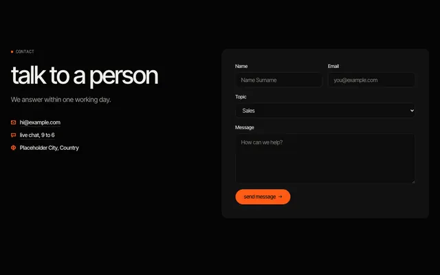 contact form Contact details beside a form with name, email, topic and message.
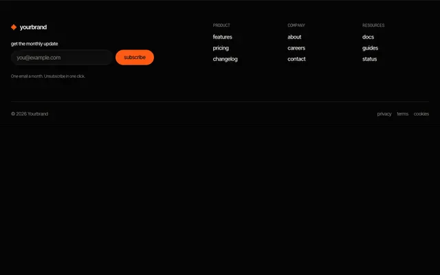 footer, columns and newsletter Link columns next to an email signup, with a legal row underneath.
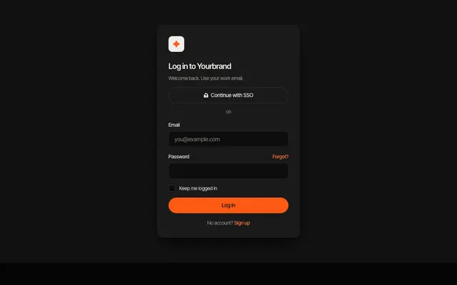 login form Email and password form with remember option and recovery link.
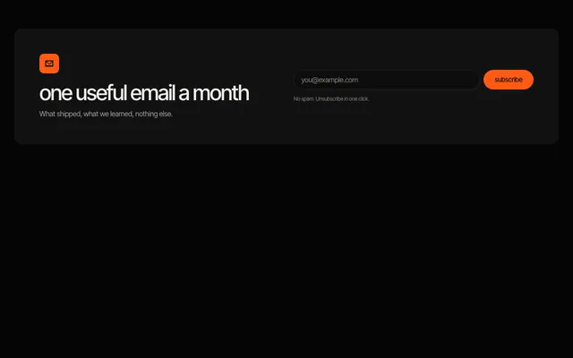 newsletter signup Headline and an inline email form with consent note.
 settings form Grouped settings: profile fields, a preference select and a toggle.
 avatar group Overlapping avatars with a remaining count, in three sizes; placeholder initials.