free UI sections and components / components
free UI components
By Andrea Buttarelli, founder of Feega
11 small interface parts, each in Svelte, React, Vue, Astro and HTML.
11 of 11 templates


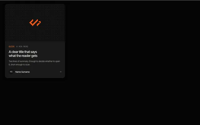

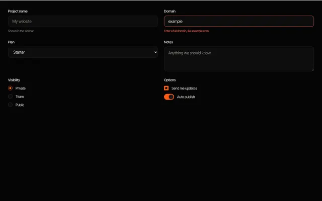

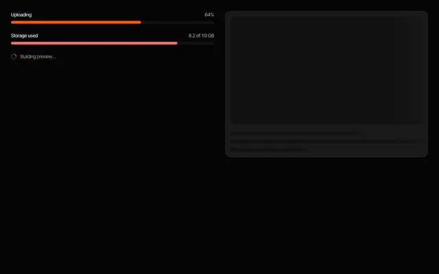

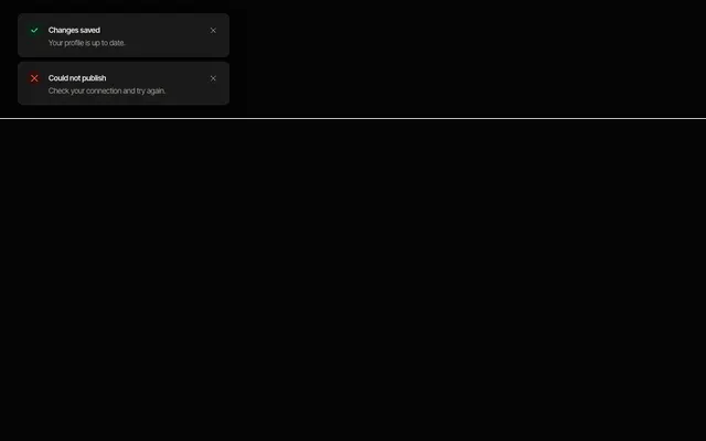
A component is a small, reusable part of an interface: a badge, a set of form inputs, a tab list, a modal, a toast. These are the pieces you place inside sections and screens, and they are the ones people tend to get subtly wrong, so each one is built on the platform where it can be.
The modal uses the native dialog element, the dropdown menu and the FAQ lean on details and summary, and the tab list follows the ARIA tabs pattern with arrow-key navigation. Where behaviour is simple, there is no script at all. The few items that need state keep it in the framework you picked.
Components share the same --feega-* tokens as the sections, so changing the accent colour, radius or font in one place restyles everything on the page, in light and dark. Every item includes focus styles that follow the focus token and respects reduced motion.
Use them as a starting point rather than a black box: the code is short, readable and yours to edit once copied. Form inputs include labels, hints and an error state, which is the part most quick implementations leave out.
questions
Can I use these components next to a UI library?
Yes. They are plain markup and scoped CSS with no runtime, so they sit next to any other library. Their class names start with fl- to avoid collisions.
Are they accessible?
They use native elements where possible and ARIA where needed, with visible focus. Always test with your own content and content-specific labels.
more templates
sections →app UI → Svelte →React →Vue →Astro → all templates →
Feega edits these components in your running app and writes the change to your code. Free, with diffs and undo.
get Feega, it is free →