free UI sections and components
By Andrea Buttarelli, founder of Feega
61 sections, components and app screens you insert or copy into your project, in Svelte, React, Vue, Astro and plain HTML.
61 of 61 templates

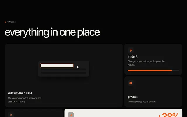
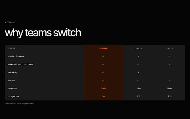
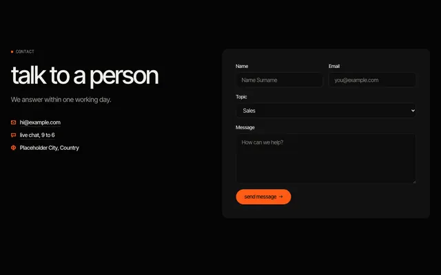

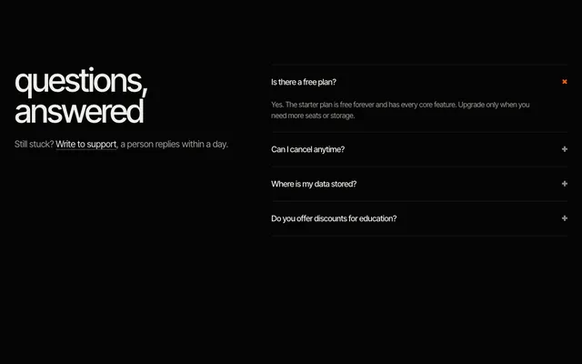
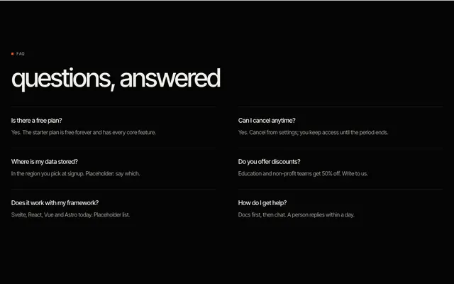
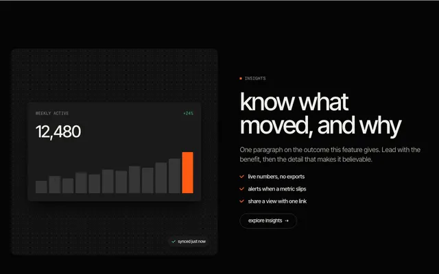
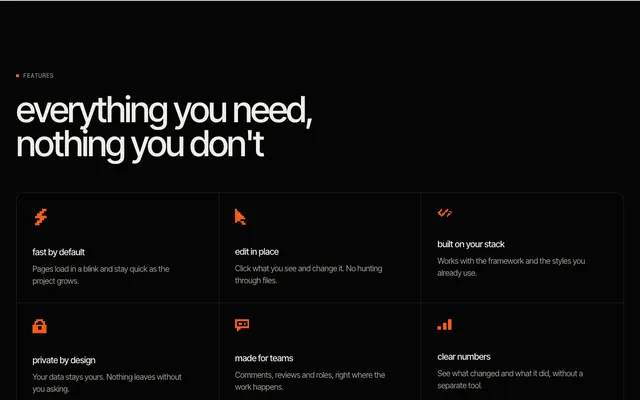
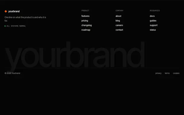
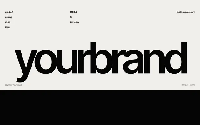
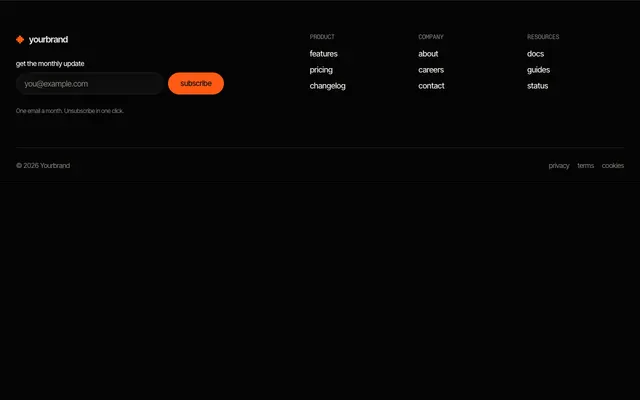
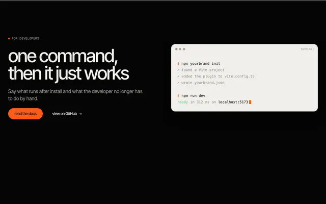
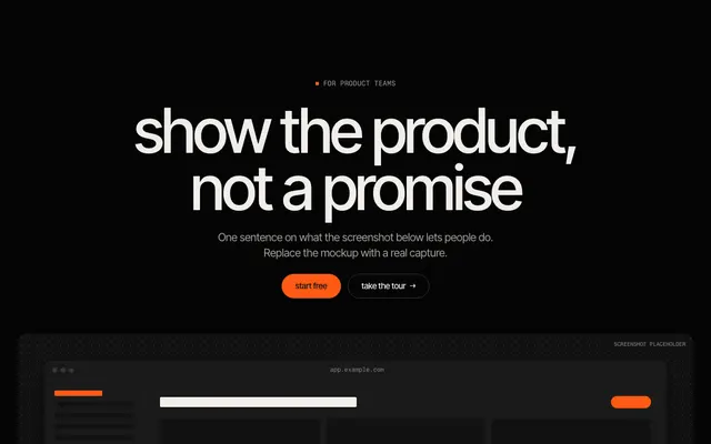
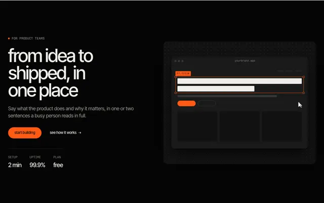

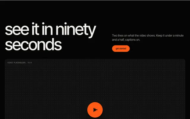
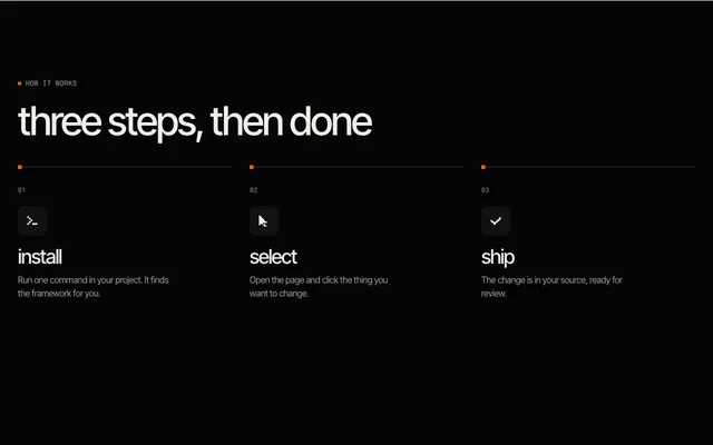
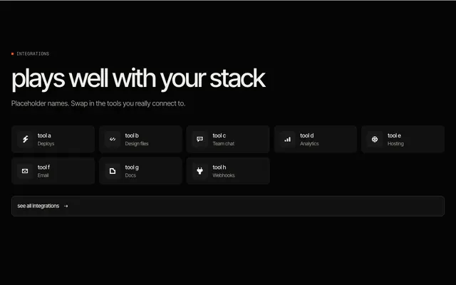
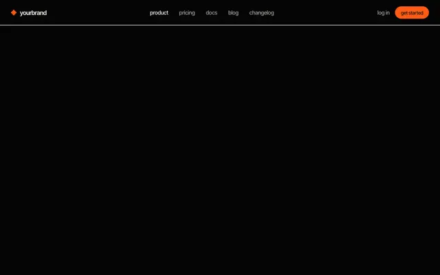
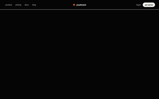
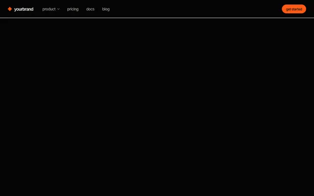 navbar, mega menu A product link that opens a wide panel of grouped links with icons; no JavaScript.

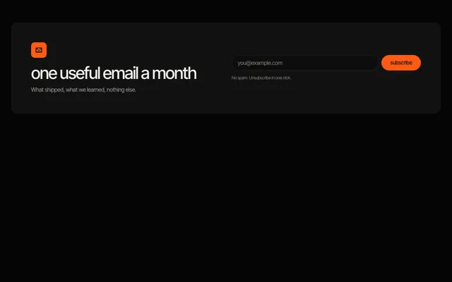
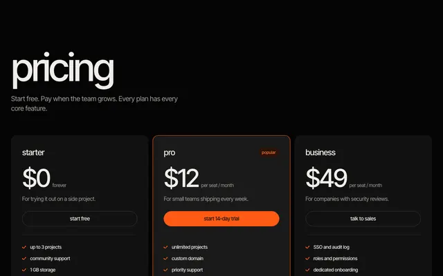
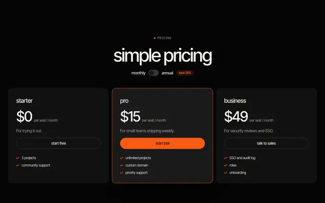





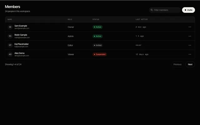
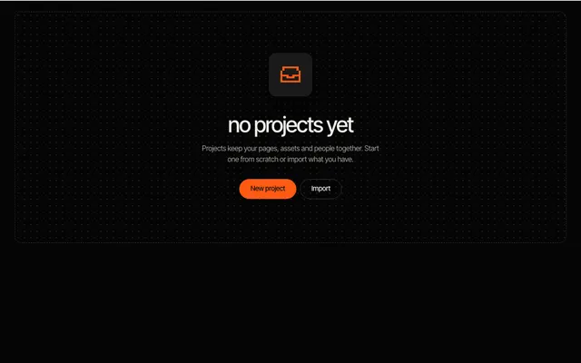
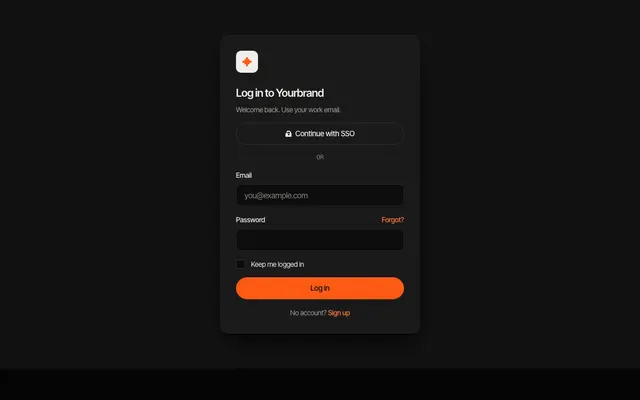
sections →·components →·app UI →
how the library works
This is the free Feega library. Every item has a live preview you can resize and switch between light and dark, the code in five flavours on the same page, and the list of tokens it reads. The extension is free and needs no account: insert an item from Add, then Library, or copy the code.
Everything is built on one small set of --feega-* custom properties for colour, type, radius and spacing. Change the accent once and every item follows, in light and dark. Items have no dependencies, so they sit next to Tailwind, a UI library or plain CSS.
Start from the categories if you know what you need, or from your framework if you want to see how the code reads in it.
- Free website sections: 40 full-width page blocks, each in Svelte, React, Vue, Astro and HTML.
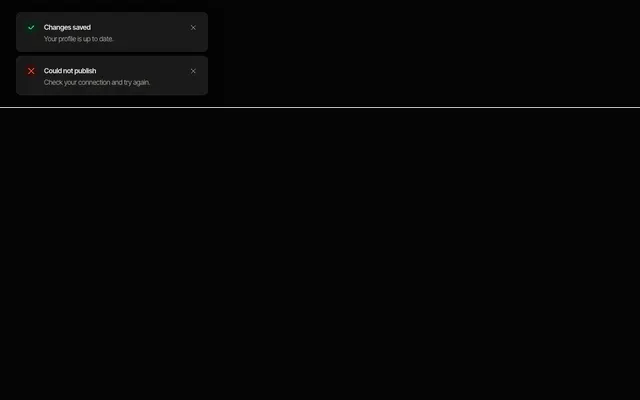
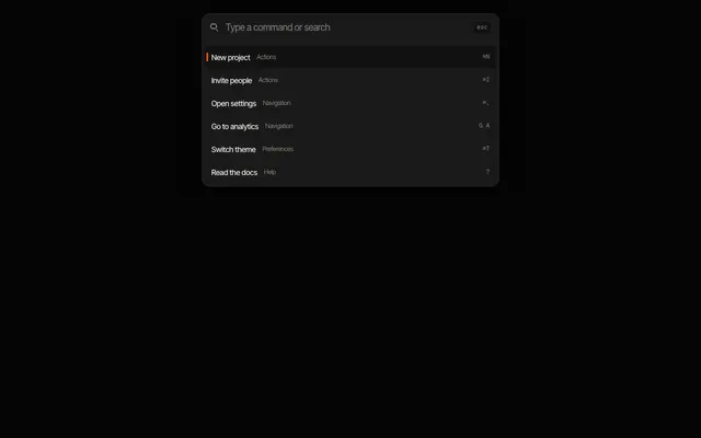
- Free UI components: 11 small interface parts, each in Svelte, React, Vue, Astro and HTML.
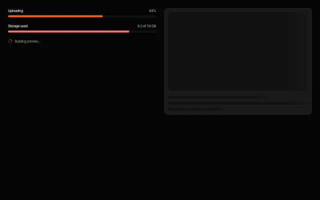
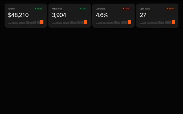
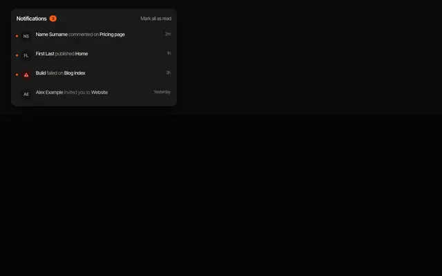
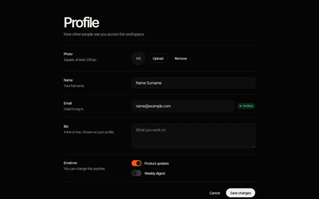
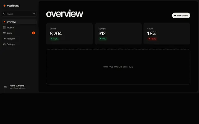
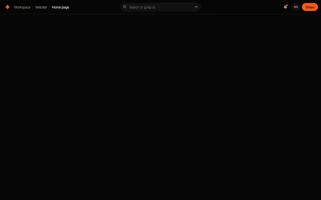
- Free app UI templates: 10 product screens and shells, each in Svelte, React, Vue, Astro and HTML.
- Free SvelteKit sections and UI templates
- Free React and Next.js sections and UI templates
- Free Vue and Nuxt sections and UI templates
- Free Astro sections and UI templates
questions
Are the templates free?
Yes. Every item in the library is free to copy and use in your own projects, under the Apache-2.0 license. Feega Cloud is planned to add Pro templates later.
Which frameworks are covered?
Svelte 5, React with TypeScript, Vue 3, Astro and plain HTML with CSS. Every item exists in all five, and the code is the same design in each.
Do I need Tailwind or a UI library?
No. Each item ships its own CSS and reads --feega-* tokens, so it works with or without Tailwind.
Can I change the colours and fonts?
Yes. Override the tokens on :root or on any ancestor element. Fonts are Inter Tight and Fragment Mono from Google Fonts, each page lists the weights it needs.
Once an item is in your project it is a normal component. Feega lets you click it in the running app and edit it like in Figma, with the change written to your code.
get Feega, it is free →