free UI sections and components / components
progress and skeleton
By Andrea Buttarelli, founder of Feega · Free · Svelte, React, Vue, Astro, HTML
Labelled progress bars, a spinner and a shimmering skeleton card for loading states.
code
<div class="fl-progress-skeleton">
  <div class="bars">
    <label>Uploading <span>64%</span><progress max="100" value="64">64%</progress></label>
    <label>Storage used <span>8.2 of 10 GB</span><progress class="warn" max="100" value="82">82%</progress></label>
    <p class="spin" role="status"><i aria-hidden="true"></i>Building preview…</p>
  </div>
  <div class="skel" aria-busy="true" aria-label="Loading">
    <span class="b img"></span>
    <span class="b line w70"></span>
    <span class="b line"></span>
    <span class="b line w40"></span>
  </div>
</div>

<style>
.fl-progress-skeleton{font-family:var(--feega-font);font-size:var(--feega-text-body);line-height:1.5;letter-spacing:var(--feega-tracking);color:var(--feega-fg);background:var(--feega-bg);-webkit-font-smoothing:antialiased}
:where(.fl-progress-skeleton) *,:where(.fl-progress-skeleton) *::before,:where(.fl-progress-skeleton) *::after{box-sizing:border-box}
:where(.fl-progress-skeleton) :is(h1,h2,h3,h4,p,ul,ol,figure,blockquote,dl,dd){margin:0}
:where(.fl-progress-skeleton) a{color:inherit;text-decoration:none}
:where(.fl-progress-skeleton) :focus-visible{outline:2px solid var(--feega-focus);outline-offset:3px}
.fl-progress-skeleton{display:grid;grid-template-columns:repeat(2,minmax(0,1fr));align-items:start;gap:var(--feega-space-8);padding:var(--feega-space-8) var(--feega-gutter)}
.fl-progress-skeleton .bars{display:grid;gap:var(--feega-space-6)}
.fl-progress-skeleton label{display:grid;grid-template-columns:1fr auto;gap:var(--feega-space-2);font-size:var(--feega-text-sm);font-weight:500}
.fl-progress-skeleton label span{color:var(--feega-fg-muted);font-variant-numeric:tabular-nums}
.fl-progress-skeleton progress{grid-column:1/-1;width:100%;height:8px;border:0;border-radius:var(--feega-radius-full);background:var(--feega-surface);overflow:hidden;appearance:none}
.fl-progress-skeleton progress::-webkit-progress-bar{background:var(--feega-surface)}
.fl-progress-skeleton progress::-webkit-progress-value{border-radius:var(--feega-radius-full);background:var(--feega-accent);transition:width var(--feega-dur) var(--feega-ease)}
.fl-progress-skeleton progress::-moz-progress-bar{border-radius:var(--feega-radius-full);background:var(--feega-accent)}
.fl-progress-skeleton .warn::-webkit-progress-value{background:var(--feega-danger)}
.fl-progress-skeleton .warn::-moz-progress-bar{background:var(--feega-danger)}
.fl-progress-skeleton .spin{display:inline-flex;align-items:center;gap:var(--feega-space-3);color:var(--feega-fg-muted);font-size:var(--feega-text-sm)}
.fl-progress-skeleton .spin i{width:16px;height:16px;border:2px solid var(--feega-line-strong);border-top-color:var(--feega-accent);border-radius:var(--feega-radius-full);animation:fl-progress-skeleton-spin 800ms linear infinite}
@keyframes fl-progress-skeleton-spin{to{transform:rotate(360deg)}}
.fl-progress-skeleton .skel{display:grid;gap:var(--feega-space-3);padding:var(--feega-space-4);border-radius:var(--feega-radius-lg);background:var(--feega-raised);box-shadow:inset 0 0 0 1px var(--feega-line)}
.fl-progress-skeleton .b{display:block;height:12px;border-radius:var(--feega-radius-xs);background:linear-gradient(90deg,var(--feega-surface) 30%,var(--feega-line) 50%,var(--feega-surface) 70%) 0 0/300% 100%;animation:fl-progress-skeleton-shine 1.4s var(--feega-ease) infinite}
@keyframes fl-progress-skeleton-shine{from{background-position:100% 0}to{background-position:0 0}}
.fl-progress-skeleton .img{height:auto;aspect-ratio:16/9;margin-bottom:var(--feega-space-2);border-radius:var(--feega-radius-md)}
.fl-progress-skeleton .w70{width:70%}
.fl-progress-skeleton .w40{width:40%}
@media (max-width:640px){.fl-progress-skeleton{grid-template-columns:minmax(0,1fr)}}
@media (prefers-reduced-motion:reduce){:where([class^="fl-"]) *,:where([class^="fl-"]) *::before,:where([class^="fl-"]) *::after{animation:none!important;transition:none!important}}
</style>
import './ProgressSkeleton.css';

export function ProgressSkeleton() {
  return (
    <div className="fl-progress-skeleton">
      <div className="bars">
        <label>Uploading <span>64%</span><progress max="100" value="64">64%</progress></label>
        <label>Storage used <span>8.2 of 10 GB</span><progress className="warn" max="100" value="82">82%</progress></label>
        <p className="spin" role="status"><i aria-hidden="true"></i>Building preview…</p>
      </div>
      <div className="skel" aria-busy="true" aria-label="Loading">
        <span className="b img"></span>
        <span className="b line w70"></span>
        <span className="b line"></span>
        <span className="b line w40"></span>
      </div>
    </div>
  );
}
.fl-progress-skeleton{font-family:var(--feega-font);font-size:var(--feega-text-body);line-height:1.5;letter-spacing:var(--feega-tracking);color:var(--feega-fg);background:var(--feega-bg);-webkit-font-smoothing:antialiased}
:where(.fl-progress-skeleton) *,:where(.fl-progress-skeleton) *::before,:where(.fl-progress-skeleton) *::after{box-sizing:border-box}
:where(.fl-progress-skeleton) :is(h1,h2,h3,h4,p,ul,ol,figure,blockquote,dl,dd){margin:0}
:where(.fl-progress-skeleton) a{color:inherit;text-decoration:none}
:where(.fl-progress-skeleton) :focus-visible{outline:2px solid var(--feega-focus);outline-offset:3px}
.fl-progress-skeleton{display:grid;grid-template-columns:repeat(2,minmax(0,1fr));align-items:start;gap:var(--feega-space-8);padding:var(--feega-space-8) var(--feega-gutter)}
.fl-progress-skeleton .bars{display:grid;gap:var(--feega-space-6)}
.fl-progress-skeleton label{display:grid;grid-template-columns:1fr auto;gap:var(--feega-space-2);font-size:var(--feega-text-sm);font-weight:500}
.fl-progress-skeleton label span{color:var(--feega-fg-muted);font-variant-numeric:tabular-nums}
.fl-progress-skeleton progress{grid-column:1/-1;width:100%;height:8px;border:0;border-radius:var(--feega-radius-full);background:var(--feega-surface);overflow:hidden;appearance:none}
.fl-progress-skeleton progress::-webkit-progress-bar{background:var(--feega-surface)}
.fl-progress-skeleton progress::-webkit-progress-value{border-radius:var(--feega-radius-full);background:var(--feega-accent);transition:width var(--feega-dur) var(--feega-ease)}
.fl-progress-skeleton progress::-moz-progress-bar{border-radius:var(--feega-radius-full);background:var(--feega-accent)}
.fl-progress-skeleton .warn::-webkit-progress-value{background:var(--feega-danger)}
.fl-progress-skeleton .warn::-moz-progress-bar{background:var(--feega-danger)}
.fl-progress-skeleton .spin{display:inline-flex;align-items:center;gap:var(--feega-space-3);color:var(--feega-fg-muted);font-size:var(--feega-text-sm)}
.fl-progress-skeleton .spin i{width:16px;height:16px;border:2px solid var(--feega-line-strong);border-top-color:var(--feega-accent);border-radius:var(--feega-radius-full);animation:fl-progress-skeleton-spin 800ms linear infinite}
@keyframes fl-progress-skeleton-spin{to{transform:rotate(360deg)}}
.fl-progress-skeleton .skel{display:grid;gap:var(--feega-space-3);padding:var(--feega-space-4);border-radius:var(--feega-radius-lg);background:var(--feega-raised);box-shadow:inset 0 0 0 1px var(--feega-line)}
.fl-progress-skeleton .b{display:block;height:12px;border-radius:var(--feega-radius-xs);background:linear-gradient(90deg,var(--feega-surface) 30%,var(--feega-line) 50%,var(--feega-surface) 70%) 0 0/300% 100%;animation:fl-progress-skeleton-shine 1.4s var(--feega-ease) infinite}
@keyframes fl-progress-skeleton-shine{from{background-position:100% 0}to{background-position:0 0}}
.fl-progress-skeleton .img{height:auto;aspect-ratio:16/9;margin-bottom:var(--feega-space-2);border-radius:var(--feega-radius-md)}
.fl-progress-skeleton .w70{width:70%}
.fl-progress-skeleton .w40{width:40%}
@media (max-width:640px){.fl-progress-skeleton{grid-template-columns:minmax(0,1fr)}}
@media (prefers-reduced-motion:reduce){:where([class^="fl-"]) *,:where([class^="fl-"]) *::before,:where([class^="fl-"]) *::after{animation:none!important;transition:none!important}}
<template>
  <div class="fl-progress-skeleton">
    <div class="bars">
      <label>Uploading <span>64%</span><progress max="100" value="64">64%</progress></label>
      <label>Storage used <span>8.2 of 10 GB</span><progress class="warn" max="100" value="82">82%</progress></label>
      <p class="spin" role="status"><i aria-hidden="true"></i>Building preview…</p>
    </div>
    <div class="skel" aria-busy="true" aria-label="Loading">
      <span class="b img"></span>
      <span class="b line w70"></span>
      <span class="b line"></span>
      <span class="b line w40"></span>
    </div>
  </div>
</template>

<style scoped>
.fl-progress-skeleton{font-family:var(--feega-font);font-size:var(--feega-text-body);line-height:1.5;letter-spacing:var(--feega-tracking);color:var(--feega-fg);background:var(--feega-bg);-webkit-font-smoothing:antialiased}
:where(.fl-progress-skeleton) *,:where(.fl-progress-skeleton) *::before,:where(.fl-progress-skeleton) *::after{box-sizing:border-box}
:where(.fl-progress-skeleton) :is(h1,h2,h3,h4,p,ul,ol,figure,blockquote,dl,dd){margin:0}
:where(.fl-progress-skeleton) a{color:inherit;text-decoration:none}
:where(.fl-progress-skeleton) :focus-visible{outline:2px solid var(--feega-focus);outline-offset:3px}
.fl-progress-skeleton{display:grid;grid-template-columns:repeat(2,minmax(0,1fr));align-items:start;gap:var(--feega-space-8);padding:var(--feega-space-8) var(--feega-gutter)}
.fl-progress-skeleton .bars{display:grid;gap:var(--feega-space-6)}
.fl-progress-skeleton label{display:grid;grid-template-columns:1fr auto;gap:var(--feega-space-2);font-size:var(--feega-text-sm);font-weight:500}
.fl-progress-skeleton label span{color:var(--feega-fg-muted);font-variant-numeric:tabular-nums}
.fl-progress-skeleton progress{grid-column:1/-1;width:100%;height:8px;border:0;border-radius:var(--feega-radius-full);background:var(--feega-surface);overflow:hidden;appearance:none}
.fl-progress-skeleton progress::-webkit-progress-bar{background:var(--feega-surface)}
.fl-progress-skeleton progress::-webkit-progress-value{border-radius:var(--feega-radius-full);background:var(--feega-accent);transition:width var(--feega-dur) var(--feega-ease)}
.fl-progress-skeleton progress::-moz-progress-bar{border-radius:var(--feega-radius-full);background:var(--feega-accent)}
.fl-progress-skeleton .warn::-webkit-progress-value{background:var(--feega-danger)}
.fl-progress-skeleton .warn::-moz-progress-bar{background:var(--feega-danger)}
.fl-progress-skeleton .spin{display:inline-flex;align-items:center;gap:var(--feega-space-3);color:var(--feega-fg-muted);font-size:var(--feega-text-sm)}
.fl-progress-skeleton .spin i{width:16px;height:16px;border:2px solid var(--feega-line-strong);border-top-color:var(--feega-accent);border-radius:var(--feega-radius-full);animation:fl-progress-skeleton-spin 800ms linear infinite}
@keyframes fl-progress-skeleton-spin{to{transform:rotate(360deg)}}
.fl-progress-skeleton .skel{display:grid;gap:var(--feega-space-3);padding:var(--feega-space-4);border-radius:var(--feega-radius-lg);background:var(--feega-raised);box-shadow:inset 0 0 0 1px var(--feega-line)}
.fl-progress-skeleton .b{display:block;height:12px;border-radius:var(--feega-radius-xs);background:linear-gradient(90deg,var(--feega-surface) 30%,var(--feega-line) 50%,var(--feega-surface) 70%) 0 0/300% 100%;animation:fl-progress-skeleton-shine 1.4s var(--feega-ease) infinite}
@keyframes fl-progress-skeleton-shine{from{background-position:100% 0}to{background-position:0 0}}
.fl-progress-skeleton .img{height:auto;aspect-ratio:16/9;margin-bottom:var(--feega-space-2);border-radius:var(--feega-radius-md)}
.fl-progress-skeleton .w70{width:70%}
.fl-progress-skeleton .w40{width:40%}
@media (max-width:640px){.fl-progress-skeleton{grid-template-columns:minmax(0,1fr)}}
@media (prefers-reduced-motion:reduce){:where([class^="fl-"]) *,:where([class^="fl-"]) *::before,:where([class^="fl-"]) *::after{animation:none!important;transition:none!important}}
</style>
---
---

<div class="fl-progress-skeleton">
  <div class="bars">
    <label>Uploading <span>64%</span><progress max="100" value="64">64%</progress></label>
    <label>Storage used <span>8.2 of 10 GB</span><progress class="warn" max="100" value="82">82%</progress></label>
    <p class="spin" role="status"><i aria-hidden="true"></i>Building preview…</p>
  </div>
  <div class="skel" aria-busy="true" aria-label="Loading">
    <span class="b img"></span>
    <span class="b line w70"></span>
    <span class="b line"></span>
    <span class="b line w40"></span>
  </div>
</div>

<style>
.fl-progress-skeleton{font-family:var(--feega-font);font-size:var(--feega-text-body);line-height:1.5;letter-spacing:var(--feega-tracking);color:var(--feega-fg);background:var(--feega-bg);-webkit-font-smoothing:antialiased}
:where(.fl-progress-skeleton) *,:where(.fl-progress-skeleton) *::before,:where(.fl-progress-skeleton) *::after{box-sizing:border-box}
:where(.fl-progress-skeleton) :is(h1,h2,h3,h4,p,ul,ol,figure,blockquote,dl,dd){margin:0}
:where(.fl-progress-skeleton) a{color:inherit;text-decoration:none}
:where(.fl-progress-skeleton) :focus-visible{outline:2px solid var(--feega-focus);outline-offset:3px}
.fl-progress-skeleton{display:grid;grid-template-columns:repeat(2,minmax(0,1fr));align-items:start;gap:var(--feega-space-8);padding:var(--feega-space-8) var(--feega-gutter)}
.fl-progress-skeleton .bars{display:grid;gap:var(--feega-space-6)}
.fl-progress-skeleton label{display:grid;grid-template-columns:1fr auto;gap:var(--feega-space-2);font-size:var(--feega-text-sm);font-weight:500}
.fl-progress-skeleton label span{color:var(--feega-fg-muted);font-variant-numeric:tabular-nums}
.fl-progress-skeleton progress{grid-column:1/-1;width:100%;height:8px;border:0;border-radius:var(--feega-radius-full);background:var(--feega-surface);overflow:hidden;appearance:none}
.fl-progress-skeleton progress::-webkit-progress-bar{background:var(--feega-surface)}
.fl-progress-skeleton progress::-webkit-progress-value{border-radius:var(--feega-radius-full);background:var(--feega-accent);transition:width var(--feega-dur) var(--feega-ease)}
.fl-progress-skeleton progress::-moz-progress-bar{border-radius:var(--feega-radius-full);background:var(--feega-accent)}
.fl-progress-skeleton .warn::-webkit-progress-value{background:var(--feega-danger)}
.fl-progress-skeleton .warn::-moz-progress-bar{background:var(--feega-danger)}
.fl-progress-skeleton .spin{display:inline-flex;align-items:center;gap:var(--feega-space-3);color:var(--feega-fg-muted);font-size:var(--feega-text-sm)}
.fl-progress-skeleton .spin i{width:16px;height:16px;border:2px solid var(--feega-line-strong);border-top-color:var(--feega-accent);border-radius:var(--feega-radius-full);animation:fl-progress-skeleton-spin 800ms linear infinite}
@keyframes fl-progress-skeleton-spin{to{transform:rotate(360deg)}}
.fl-progress-skeleton .skel{display:grid;gap:var(--feega-space-3);padding:var(--feega-space-4);border-radius:var(--feega-radius-lg);background:var(--feega-raised);box-shadow:inset 0 0 0 1px var(--feega-line)}
.fl-progress-skeleton .b{display:block;height:12px;border-radius:var(--feega-radius-xs);background:linear-gradient(90deg,var(--feega-surface) 30%,var(--feega-line) 50%,var(--feega-surface) 70%) 0 0/300% 100%;animation:fl-progress-skeleton-shine 1.4s var(--feega-ease) infinite}
@keyframes fl-progress-skeleton-shine{from{background-position:100% 0}to{background-position:0 0}}
.fl-progress-skeleton .img{height:auto;aspect-ratio:16/9;margin-bottom:var(--feega-space-2);border-radius:var(--feega-radius-md)}
.fl-progress-skeleton .w70{width:70%}
.fl-progress-skeleton .w40{width:40%}
@media (max-width:640px){.fl-progress-skeleton{grid-template-columns:minmax(0,1fr)}}
@media (prefers-reduced-motion:reduce){:where([class^="fl-"]) *,:where([class^="fl-"]) *::before,:where([class^="fl-"]) *::after{animation:none!important;transition:none!important}}
</style>
<div class="fl-progress-skeleton">
  <div class="bars">
    <label>Uploading <span>64%</span><progress max="100" value="64">64%</progress></label>
    <label>Storage used <span>8.2 of 10 GB</span><progress class="warn" max="100" value="82">82%</progress></label>
    <p class="spin" role="status"><i aria-hidden="true"></i>Building preview…</p>
  </div>
  <div class="skel" aria-busy="true" aria-label="Loading">
    <span class="b img"></span>
    <span class="b line w70"></span>
    <span class="b line"></span>
    <span class="b line w40"></span>
  </div>
</div>
.fl-progress-skeleton{font-family:var(--feega-font);font-size:var(--feega-text-body);line-height:1.5;letter-spacing:var(--feega-tracking);color:var(--feega-fg);background:var(--feega-bg);-webkit-font-smoothing:antialiased}
:where(.fl-progress-skeleton) *,:where(.fl-progress-skeleton) *::before,:where(.fl-progress-skeleton) *::after{box-sizing:border-box}
:where(.fl-progress-skeleton) :is(h1,h2,h3,h4,p,ul,ol,figure,blockquote,dl,dd){margin:0}
:where(.fl-progress-skeleton) a{color:inherit;text-decoration:none}
:where(.fl-progress-skeleton) :focus-visible{outline:2px solid var(--feega-focus);outline-offset:3px}
.fl-progress-skeleton{display:grid;grid-template-columns:repeat(2,minmax(0,1fr));align-items:start;gap:var(--feega-space-8);padding:var(--feega-space-8) var(--feega-gutter)}
.fl-progress-skeleton .bars{display:grid;gap:var(--feega-space-6)}
.fl-progress-skeleton label{display:grid;grid-template-columns:1fr auto;gap:var(--feega-space-2);font-size:var(--feega-text-sm);font-weight:500}
.fl-progress-skeleton label span{color:var(--feega-fg-muted);font-variant-numeric:tabular-nums}
.fl-progress-skeleton progress{grid-column:1/-1;width:100%;height:8px;border:0;border-radius:var(--feega-radius-full);background:var(--feega-surface);overflow:hidden;appearance:none}
.fl-progress-skeleton progress::-webkit-progress-bar{background:var(--feega-surface)}
.fl-progress-skeleton progress::-webkit-progress-value{border-radius:var(--feega-radius-full);background:var(--feega-accent);transition:width var(--feega-dur) var(--feega-ease)}
.fl-progress-skeleton progress::-moz-progress-bar{border-radius:var(--feega-radius-full);background:var(--feega-accent)}
.fl-progress-skeleton .warn::-webkit-progress-value{background:var(--feega-danger)}
.fl-progress-skeleton .warn::-moz-progress-bar{background:var(--feega-danger)}
.fl-progress-skeleton .spin{display:inline-flex;align-items:center;gap:var(--feega-space-3);color:var(--feega-fg-muted);font-size:var(--feega-text-sm)}
.fl-progress-skeleton .spin i{width:16px;height:16px;border:2px solid var(--feega-line-strong);border-top-color:var(--feega-accent);border-radius:var(--feega-radius-full);animation:fl-progress-skeleton-spin 800ms linear infinite}
@keyframes fl-progress-skeleton-spin{to{transform:rotate(360deg)}}
.fl-progress-skeleton .skel{display:grid;gap:var(--feega-space-3);padding:var(--feega-space-4);border-radius:var(--feega-radius-lg);background:var(--feega-raised);box-shadow:inset 0 0 0 1px var(--feega-line)}
.fl-progress-skeleton .b{display:block;height:12px;border-radius:var(--feega-radius-xs);background:linear-gradient(90deg,var(--feega-surface) 30%,var(--feega-line) 50%,var(--feega-surface) 70%) 0 0/300% 100%;animation:fl-progress-skeleton-shine 1.4s var(--feega-ease) infinite}
@keyframes fl-progress-skeleton-shine{from{background-position:100% 0}to{background-position:0 0}}
.fl-progress-skeleton .img{height:auto;aspect-ratio:16/9;margin-bottom:var(--feega-space-2);border-radius:var(--feega-radius-md)}
.fl-progress-skeleton .w70{width:70%}
.fl-progress-skeleton .w40{width:40%}
@media (max-width:640px){.fl-progress-skeleton{grid-template-columns:minmax(0,1fr)}}
@media (prefers-reduced-motion:reduce){:where([class^="fl-"]) *,:where([class^="fl-"]) *::before,:where([class^="fl-"]) *::after{animation:none!important;transition:none!important}}
tokens.css, the shared file every template reads
:root,
[data-theme="light"] {
  color-scheme: light;
  --feega-bg: #f7f6f2;
  --feega-surface: #efede7;
  --feega-raised: #ffffff;
  --feega-input: #ffffff;
  --feega-fg: #121212;
  --feega-fg-muted: #5c5a55;
  --feega-fg-subtle: #6d6a63;
  --feega-line: #e2dfd7;
  --feega-line-strong: #cdc9bf;
  --feega-dot: #d3cfc5;
  --feega-accent: #ff4f00;
  --feega-accent-hover: #ff6a26;
  --feega-accent-fg: #121212;
  --feega-accent-soft: #ffe8dc;
  --feega-accent-text: #b83800;
  --feega-danger: #c0231a;
  --feega-danger-fg: #ffffff;
  --feega-danger-soft: #fde6e3;
  --feega-success: #12703a;
  --feega-success-soft: #e0f3e6;
  --feega-focus: #ff4f00;
  --feega-overlay: rgb(18 18 18 / 0.4);
  --feega-shadow: 0 1px 2px rgb(18 18 18 / 0.05), 0 8px 24px -8px rgb(18 18 18 / 0.12);
  --feega-shadow-float: 0 2px 4px rgb(18 18 18 / 0.06), 0 24px 48px -12px rgb(18 18 18 / 0.22);
  --feega-radius-xs: 2px;
  --feega-radius-sm: 6px;
  --feega-radius-md: 10px;
  --feega-radius-lg: 16px;
  --feega-radius-full: 999px;
  --feega-font: "Inter Tight", ui-sans-serif, system-ui, -apple-system, "Segoe UI", Roboto, "Helvetica Neue", Arial, sans-serif;
  --feega-font-display: var(--feega-font);
  --feega-font-mono: "Fragment Mono", ui-monospace, "SF Mono", Menlo, Consolas, monospace;
  --feega-tracking: -0.02em;
  --feega-tracking-tight: -0.05em;
  --feega-text-xs: 0.75rem;
  --feega-text-sm: 0.875rem;
  --feega-text-body: 1rem;
  --feega-text-lg: clamp(1.0625rem, 1.6vw, 1.25rem);
  --feega-text-xl: 1.5rem;
  --feega-text-title: clamp(2.5rem, 6vw, 4.5rem);
  --feega-text-display: clamp(3rem, 9.5vw, 7rem);
  --feega-ease: cubic-bezier(0.16, 1, 0.3, 1);
  --feega-dur-fast: 160ms;
  --feega-dur: 420ms;
  --feega-space-1: 0.25rem;
  --feega-space-2: 0.5rem;
  --feega-space-3: 0.75rem;
  --feega-space-4: 1rem;
  --feega-space-6: 1.5rem;
  --feega-space-8: 2rem;
  --feega-space-12: 3rem;
  --feega-space-16: 4rem;
  --feega-space-section: clamp(4.5rem, 11vw, 9rem);
  --feega-gutter: clamp(1rem, 4vw, 2rem);
  --feega-max-width: 76rem;
}

@media (prefers-color-scheme: dark) {
  :root:not([data-theme="light"]) {
    color-scheme: dark;
    --feega-bg: #050505;
    --feega-surface: #121212;
    --feega-raised: #1a1a1a;
    --feega-input: #0d0d0d;
    --feega-fg: #f0eee9;
    --feega-fg-muted: #a3a09a;
    --feega-fg-subtle: #8a877f;
    --feega-line: #232323;
    --feega-line-strong: #363636;
    --feega-dot: #2c2c2c;
    --feega-accent: #ff5a14;
    --feega-accent-hover: #ff7333;
    --feega-accent-fg: #121212;
    --feega-accent-soft: #2b1206;
    --feega-accent-text: #ff7a3d;
    --feega-danger: #ff6b5e;
    --feega-danger-fg: #121212;
    --feega-danger-soft: #2e0f0c;
    --feega-success: #4cc47a;
    --feega-success-soft: #0d2617;
    --feega-focus: #ff5a14;
    --feega-overlay: rgb(0 0 0 / 0.7);
    --feega-shadow: 0 1px 2px rgb(0 0 0 / 0.5), 0 8px 24px -8px rgb(0 0 0 / 0.6);
    --feega-shadow-float: 0 2px 4px rgb(0 0 0 / 0.5), 0 24px 48px -12px rgb(0 0 0 / 0.8);
  }
}

[data-theme="dark"] {
  color-scheme: dark;
  --feega-bg: #050505;
  --feega-surface: #121212;
  --feega-raised: #1a1a1a;
  --feega-input: #0d0d0d;
  --feega-fg: #f0eee9;
  --feega-fg-muted: #a3a09a;
  --feega-fg-subtle: #8a877f;
  --feega-line: #232323;
  --feega-line-strong: #363636;
  --feega-dot: #2c2c2c;
  --feega-accent: #ff5a14;
  --feega-accent-hover: #ff7333;
  --feega-accent-fg: #121212;
  --feega-accent-soft: #2b1206;
  --feega-accent-text: #ff7a3d;
  --feega-danger: #ff6b5e;
  --feega-danger-fg: #121212;
  --feega-danger-soft: #2e0f0c;
  --feega-success: #4cc47a;
  --feega-success-soft: #0d2617;
  --feega-focus: #ff5a14;
  --feega-overlay: rgb(0 0 0 / 0.7);
  --feega-shadow: 0 1px 2px rgb(0 0 0 / 0.5), 0 8px 24px -8px rgb(0 0 0 / 0.6);
  --feega-shadow-float: 0 2px 4px rgb(0 0 0 / 0.5), 0 24px 48px -12px rgb(0 0 0 / 0.8);
}
what it is
Progress and skeleton is a free component. Labelled progress bars, a spinner and a shimmering skeleton card for loading states. It is tagged progress, loading and skeleton.
It is markup and CSS only, with no script in any version.
Size per version: Svelte 1 file, 43 lines; React 2 files, 47 lines; Vue 1 file, 45 lines; Astro 1 file, 46 lines; HTML 2 files, 41 lines.
tokens this template reads
| Token | Controls | Uses |
|---|---|---|
| --feega-radius-full | fully round pills and buttons | 4 |
| --feega-surface | quiet panels and chips | 4 |
| --feega-accent | the brand colour on primary actions | 3 |
| --feega-danger | destructive actions and errors | 2 |
| --feega-ease | the animation curve | 2 |
| --feega-fg-muted | secondary text | 2 |
| --feega-line | hairline borders and dividers | 2 |
| --feega-space-2 | spacing step 2 | 2 |
| --feega-space-3 | spacing step 3 | 2 |
| --feega-space-8 | spacing step 8 | 2 |
| --feega-text-sm | small text size | 2 |
| --feega-bg | the page background | 1 |
To restyle it, set any of these custom properties on :root, or on an ancestor of the template to change it in one place only. For example, --feega-accent changes the brand colour in light and dark alike. Add the shared tokens.css once per project.
fonts
It uses Inter Tight (400, 500, 600) from Google Fonts. Without them the font tokens fall back to a system stack.
<link rel="stylesheet" href="https://fonts.googleapis.com/css2?family=Inter+Tight:wght@400;500;600&display=swap" />insert with Feega
Open Add, then Library, and click Insert or drag it into your running app. Feega writes the component, tokens and fonts for your framework. One undo. how it works
Free VS Code extension. No account, no AI.
get feega →related templates
 avatar group Overlapping avatars with a remaining count, in three sizes; placeholder initials.
 badge set Status, count, outline and removable tag badges in every tone.
 breadcrumbs Trail of links ending at the current page; middle items hide on phones.
 card Image placeholder, title, text and a link.
 dropdown menu Button that opens a menu with icons, shortcuts, a divider and a danger item; native details, no script.
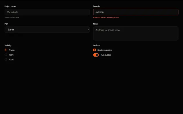 form inputs Text input, select, checkbox, radio, switch and textarea with labels, hints and an error state.