free UI sections and components / Vue
free Vue and Nuxt sections and UI templates
By Andrea Buttarelli, founder of Feega
Vue 3 single-file components with script setup, TypeScript and scoped styles, ready for Nuxt and Vite.
61 of 61 templates
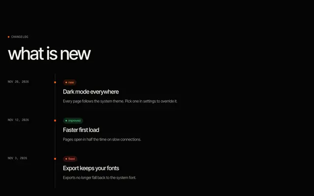
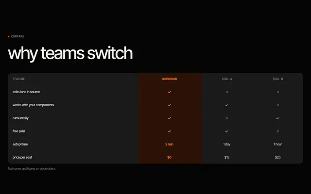
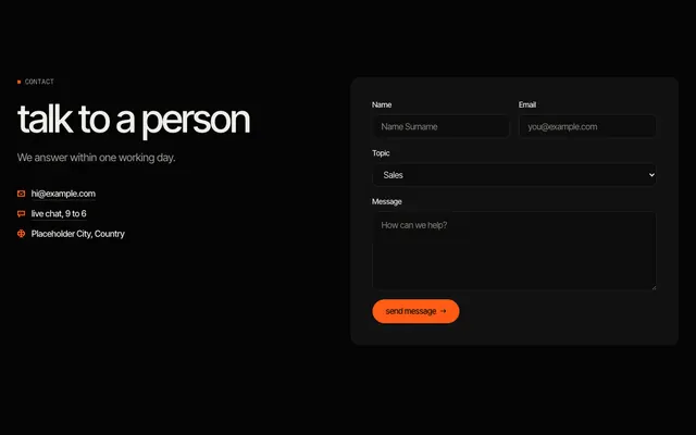
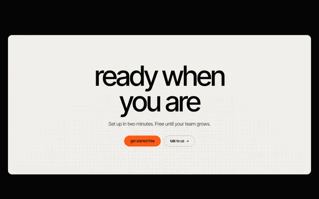
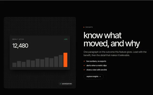
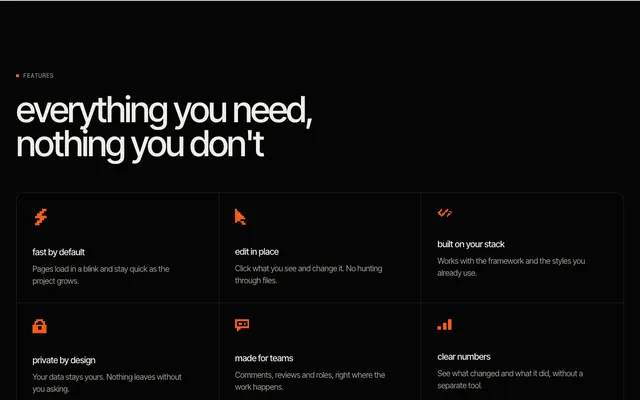
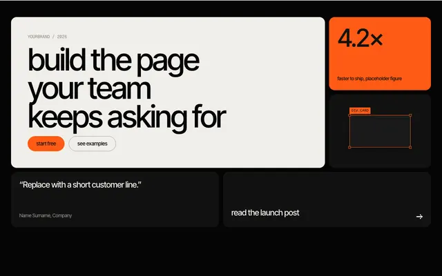
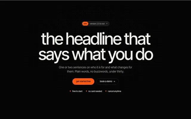
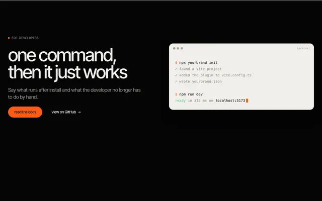
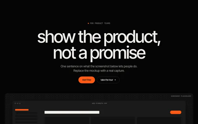
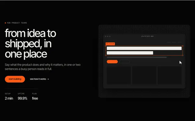

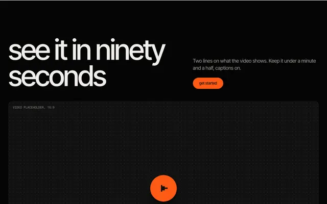
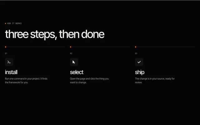
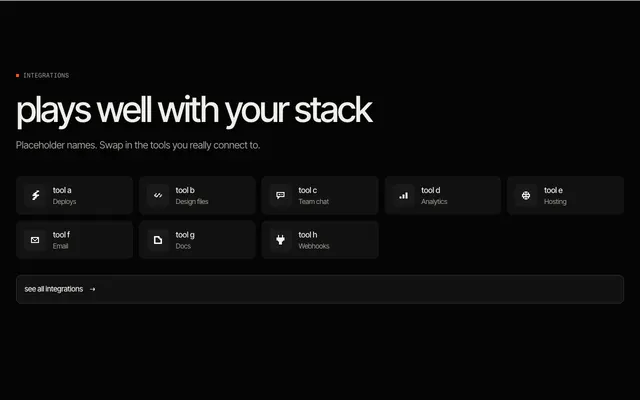
 navbar, mega menu A product link that opens a wide panel of grouped links with icons; no JavaScript.






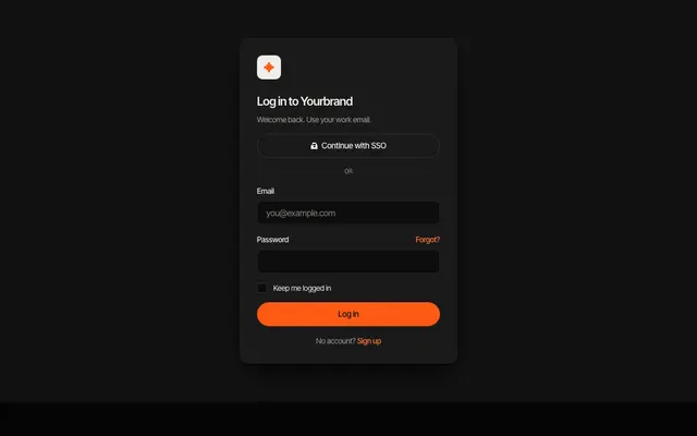
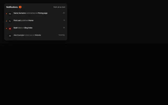
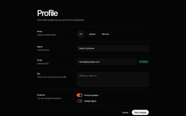
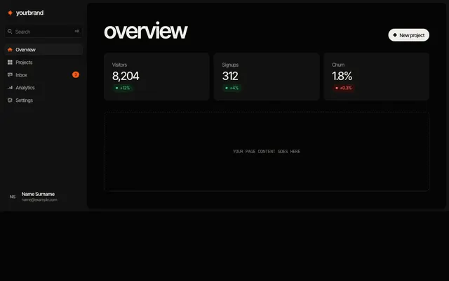
sections →·components →·app UI →
what you get in Vue
Each item is one single-file component with a template and a scoped style block. Items that hold state use script setup with lang="ts" and the ref function; the rest are template and style only. There is no Options API, no plugin and no dependency.
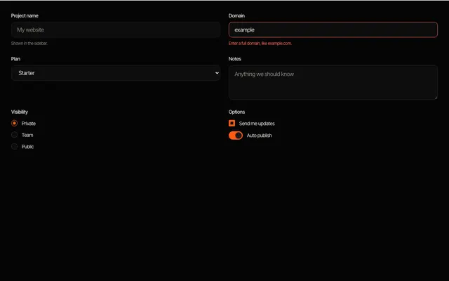
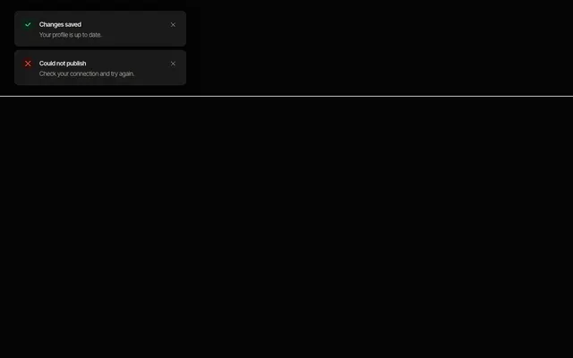
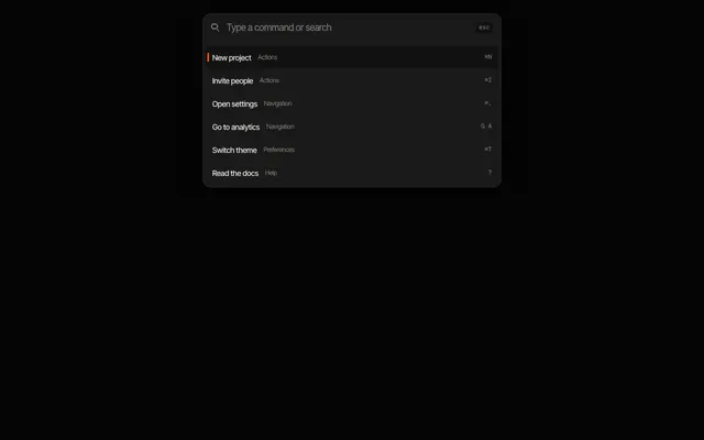
Scoped styles keep each item from leaking into your app, and the selectors are plain class selectors, so overriding them from your own CSS is straightforward. Interactive items such as tabs, toast and the command palette use ref and a keydown handler, with no external library.
Nuxt and Vite
In Nuxt, put files in components/ and they are auto-imported by name, so HeroSplit.vue becomes <HeroSplit />. Add the tokens file to the css array in nuxt.config, and the Google Fonts link under app.head.link. Items render on the server and hydrate without extra setup.
In a Vite project, import the component where you use it and import the tokens file in main.ts.
tokens and fonts
Every item reads its colours, radii, spacing and fonts from --feega-* custom properties. Add the shared tokens file once, in nuxt.config (css) or main.ts, and override any token on :root (or on any ancestor) to retheme everything. Dark follows prefers-color-scheme, and data-theme="light" or data-theme="dark" on an element forces a theme for that subtree.
Items use two Google Fonts families, Inter Tight and Fragment Mono. Add one stylesheet link in the head of index.html or through Nuxt app.head, with the weights listed on each item page. Without it, the font tokens fall back to a system stack, so nothing breaks.
changing the content and the look
Each file is short and readable. Copy, links and lists sit in the markup or at the top of the component, so replacing the placeholder content is a find and replace. Class names start with fl- and are plain selectors, so you can restyle one item by editing its CSS, or override a token to change all of them at once.
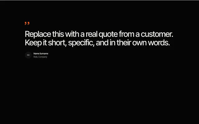
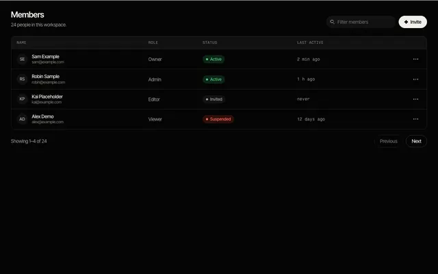
Placeholder content is marked as such: testimonials, team members and logos use obvious stand-ins, so nothing invented ships by accident. Replace them before you publish.
editing them with Feega
Once an item is in your project it is ordinary Vue code, so the Feega extension edits it like any other component: click it in your running app, change spacing, colour or radius in the panel, and the change is written into the component's scoped style block, or into the class if the project uses Tailwind. Nothing is generated at runtime and no AI is involved. You review every edit as a diff.
tokens.css is the shared file every item reads.
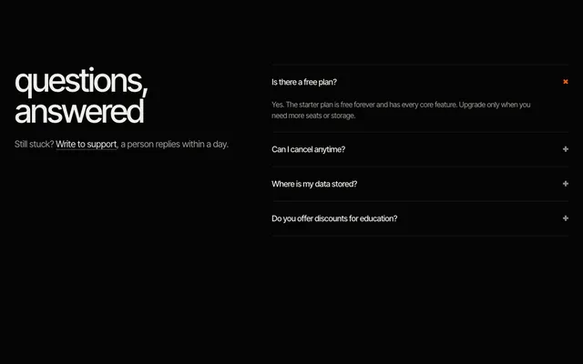
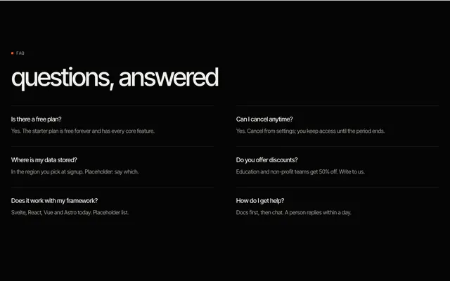
questions
Does it work with Nuxt 3?
Yes. Components auto-import from the components folder, and there is nothing to register.
Is it Vue 3 only?
Yes. Items use script setup, which needs Vue 3.
Do I need a UI library?
No. Everything is plain markup, scoped CSS and tokens.
more templates
sections →components →app UI → Svelte →React →Astro → all templates →
Feega edits these components in your running app and writes the change to your code. Free, with diffs and undo.
get Feega, it is free →